25 Email Design Best Practices for Everlasting Inspiration
You finish writing your email and can't wait to send it off. But before you do, you pause. What if it doesn't look good when it reaches my subscribers? What if half my subscribers can't even see the email because they read on mobile, and my designs are too complex for their device to render? What if my carefully crafted email copy is buried under an avalanche of code? These email design worries are common, and for good reason. A few simple tweaks to your email's design and structure could mean the difference between your subscribers enjoying your email or opening it only to be disappointed and confused. Following email design, best practices can help you avoid the scenario above and create visually appealing, highly engaging emails that effectively capture your subscribers' attention and drive conversions. This blog will explore email design best practices and offer valuable insights to help your improve email deliverability.
Email design best practices don’t just make your emails look pretty. They help you ensure your emails render correctly so subscribers can enjoy your created content instead of getting stuck in a maze of confusing code. Blocfree’s email template builder can help you easily implement these design best practices so you can focus on what matters: creating engaging email copy that converts.
Why Email Design Matters

In 2023, approximately 347 billion emails were sent and received daily worldwide. This figure will increase to over 408 billion daily emails in 2027. With email users expected to reach 4.7 billion by 2026, mastering email design is crucial for achieving and converting your target audience. Email recipients often scan information and abandon emails that don’t offer them value or appear too dense. That’s why having excellent email design is so critical; it’ll help you capture the attention of and engage your email recipients.
Visual Email Design Improves Engagement
Human beings are visual creatures. We are hard-wired to respond better to information when it is represented using visual media than plain text. Good content is worth its weight in gold, but when accompanied by mediocre design, it doesn’t leave even half of the impact it was destined to.
The same holds in the area of email marketing. No matter how many hours you spend poring over your email subject lines, copy, and CTA phrases, you’ll never get the desired results unless you dial up your design game.
Email Design Affects Performance Metrics
What are you hoping to achieve if you’re not tracking your metrics? If you don’t know how your target market is responding to your efforts to engage with them, then you’ll have no way to refine your approach iteratively.
Plain text emails don’t allow you to track the open rate of your email campaign, which means you’ll be none the wiser about your performance. Take the time to build metrics into your campaign, and you’ll soon be able to make the tweaks and adjustments that will prove pivotal to your success.
Here are some KPIs and other metrics that you should be tracking:
- Open Rates
- Clicks
- Email Sharing And Forwarding
- List Growth
- Subscriber Engagement
- Conversions
Many of these cannot be tracked if you aren’t unless you are using HTML-based emails, a necessity for good email design. To set your email metrics, consider the overall goals of your campaign. Then, choose what to track based on those goals.
Good Email Design Optimizes Information Uptake
Did you know people’s brains can recognize images in as little as 13 milliseconds? Your brain has evolved to respond far faster to imagery than text, which a well-designed email should consider. It’s all about figuring out how your customers’ brains work; imagery is significant.
If you lead with a strong hero image, it will instantly catch the eye and ensure far more people stay engaged, just what you’re looking for if you want recipients to read through your email copy. HTML emails can help you create an appealing email design to visualize your content best. There are even many great visual email template builders that you can use for free.
Responsive Email Design Presents Information Clearly
Mobile browsing rates now exceed desktop browsing, but both are still common. You must create email campaigns that adjust to the user’s device type and screen size. Get it right, and you can present your products and services in the palm of your hand.
If you get it wrong with an email that doesn’t display correctly, your email will quickly be deleted. Responsive email design has a huge impact on click-through rates. A responsive email template builder will help you create emails that render perfectly on all devices.
Related Reading
25 Email Design Best Practices To Boost Engagement and Performance

1. Specify Your Sender Name
Your sender name is an essential element of email design. It massively influences your open rates. As the first thing your contacts see, it’s arguably more important than your subject line. Why? It establishes trust from the get-go.
Choosing the Right Sender Name for Your Emails
Frequent email users know how to sort out the good from the bad. It’s a subconscious thing they do to filter hundreds of emails daily. Your contacts look at the sender's name to determine whether or not an email is spam. Incorporate your brand name into your sender name. This helps establish trust and separates you from spammy content.
Personalizing Your Sender Name for Better Engagement
Use your company name alone to reinforce brand recognition, or personalize it with an employee’s first name. For example, using ‘Sarah at Brevo’ is an effective way to engage your contacts on a more personal level. Many larger companies use a sender name to differentiate departments, products, and services.
For example, ‘Brevo News’ or ‘Brevo Customer Service’ reveals key information about the message. The most important thing is that your sender name displays a real name, not an email address.
2. Grab Attention With Your Subject Line
Your email subject lines should be short, informative, and catch the reader's attention. Make sure to highlight the most important message.
Be upfront. Most users will only take a glance, so you need to grab their attention within the first few words. The average character limit set by various email providers is 50 characters. Aim to keep it or your subject line will be cut short. And remember that mobile users see even less of the message.
Tip: Avoid overdoing it with excessive capitalization, special characters, or punctuation. This kind of messaging makes your brand seem less trustworthy, and the email could also be classified as spam.
3. Customize Your Preheader Text
Preheader text is a short snippet of text. It immediately follows the subject line when viewing an email in the inbox. Preheaders add valuable context to your subject line and boost your open rates. The subject line and preheader text should go hand in hand. Together they tell your readers a story.
The Importance of Email Preheaders
Without customizing, it will read as the first text in your email. Your preheader could be "View this email in your browser.” Now that wouldn't give the best first impression, would it? Data shows that messages with preheaders have average open rates of around 32.95%. That’s over 7% more than emails without preheaders. Yet surprisingly, only 34.23% of messages have one.
Creating Effective Preheaders for Your Emails
While this could only be a correlation, we believe subheaders work and are worth a try. Adding a “view this message online” link to your preheader won’t take too long, and it can help your audience view the newsletter, even if the images have been automatically blocked by their email client.
Preheaders on Open Rates
The impact of including a preheader in emails based on the Email Marketing Benchmarks report data. Impact of email preheader on open rates. Source: Email Marketing Benchmarks How to create a good preheader Think of the preheader as the extension of your subject line. Your additional chance to provide more value or something else interesting that you couldn’t fit into your subject line.
Inspiring Preheader Examples
The best approach is to create these two elements in pair so that the preheader builds upon and enhances your subject line. Let’s check them out again here:
- Email subject line: Drop Everything. Sitewide Sale. Now.
- Preheader text: It’s our birthday 🎉 Sitewide Sale + Free Shipping & Returns to celebrate!
- Subject line: It’s now or never!
- Preheader: Only 8 hours left on these Cyber Monday deals
Preheader Length
One thing to keep in mind is that it may be difficult to estimate how much of your preheader will be visible in the email client, as you can observe in the image below. This image shows emails with different preheader lengths visible in the mailbox preview.
4. Get Personal With Your Content
This year we expect to hear less and less about B2B and B2C marketing. 2024 is about human-to-human marketing. We are seeing a shift away from sending generic, one-to-many emails. Instead, personalization is trending.
Personalizing Your Emails for Maximum Impact
Email design best practices favor sending one-to-one emails tailored to customer behavior. Features like email automation, lead scoring, and segmentation help tailor content to individuals, leading to dynamic, innovative, and relevant emails.
Using Dynamic Content to Enhance Email Engagement
Take your emails beyond first-name greetings. Adapting content based on user interests and behavior truly personalizes them. For example, you can send personalized product recommendations, offers, and abandoned cart emails. Take a look at this example. It incorporates a live countdown timer leading up to an event.
The Power of Personalized Emails in Building Customer Relationships
Animations like this create a sense of urgency and inspire customers to commit to purchasing. Make your emails count. Personalized emails with dynamic content will not only set your brand apart, but also forge stronger connections with your customers.
5. Design Your Emails Using Visual Hierarchy
As consumers, we tend to follow predictable patterns when engaging with content. Visual hierarchy helps to guide readers' attention in emails, directing readers to the most important elements. Visual hierarchy is an email design best practice, allowing people to scan content easily.
Let’s take a look at two email layouts using a visual hierarchy:
The Z Pattern
The Z pattern (or zig-zag) effectively gets subscribers to read through all your email content. This strategy plays on patterns of eye movement. Reading left to right, we tend to jump ahead when engaging with content. Keep users interested by spreading eye-catching content throughout the message. This reduces the chance of them getting bored halfway through.
The Inverted Pyramid
Another strategy to consider is the inverted pyramid email layout. The top of the pyramid catches the reader's attention. Then, you narrow their focus to the primary goal of your email, which might be a:
- Call to action
- Product feature
- Special offer
Some final tips on email layout:
- People tend to place more value in larger objects.
- Highlight important information with larger text, blocks, or bolder fonts.
- People also perceive elements higher up on the page as more important. Start your email with your key points.
- White space helps to separate different parts of your content. Use it to communicate information in a clear, organized and attractive way.
6. Use an Email Template
You don't have to be a graphic design expert to craft beautiful emails. Using an email newsletter template is a great way to get started. Email templates help speed up the design process. They also give your content a professional-looking structure.
Ready-Made HTML Email Templates
The first option is to use ready-made templates. Many hand-crafted email templates can be used for personal and commercial purposes. They fit various occasions and can benefit any campaign. They are an excellent option for those not picky about the design and ready to mess with code to change dummy content and introduce some adjustments to fit the brand identity.
Drag-and-Drop Email Builders
The second way is more progressive. Drag-and-drop email builders are lifesavers. You do not need design and coding skills since you have a collection of hand-crafted modules and an intuitive playground to let your imagination run wild. You can create any email design by choosing the desired component from the collection and arranging it how you see it. You can alter all details, including:
- Color
- Background
- Typography
- Images
It is handy, cost-effective, and time-efficient. Drag-and-drop builders can be found in ESPs.
Exploring Third-Party Email Builders
Almost every popular provider offers customers a playground for building a template from scratch by dragging and dropping elements. However, there are some flaws.
- They are limited in terms of modules and functionality.
- They need full compatibility.
- They are pretty generic since there are no stylish features or interactive elements.
To overcome these issues, you can try third-party email builders like Postcards. Postcards comes with 100 stylish field-tested modules:
- Menus
- Call to actions
- E-commerce elements
- Hero area
- Footers
- Transactional components
- Lists, etc.
It also offers:
- Direct preview
- Cloud image hosting
- Project management
- Version history
You can export the result right into:
- Mailchimp email templates
- HubSpot
- HTML/ZIP
7. Stay Consistent With Brand Identity
Don’t feel obligated to stick to a template’s design features. Templates are a great foundation for effective email design. But they’re also an opportunity for your brand image to shine through. We recommend changing anything inconsistent with your brand image.
Ensure your email templates match your visual identity to help your recipients form a stronger relationship with your brand. This means that your logo, imagery, typography, colors, and call-to-action buttons need to be consistent with what you’re presenting on your website and other marketing channels.
If you’re still working on an established visual identity, consider these pointers:
- Create a color scheme using interesting, complementary colors. If you don’t know how, you can generate them using Coolors (free) tool. That means you’ll have specific colors for individual elements like headers, CTAs, and copy.
- Choose up to two fonts that work well together and use them throughout your emails: one for the headlines and one for the main text and CTAs.
- Don’t overcomplicate your email templates. Make sure that they’re simple, aesthetically pleasing, and recognizable.
- Look for inspiration in articles like this on best email marketing examples and sites like ReallyGoodEmails or Email Love.
Your Company Logo
Adding your company logo to your emails can help you distinguish your brand from all the other businesses your recipients will see in their inboxes. In the email template itself, you’ll want to add the logo at the very top of your message, either in the middle or the left corner. Some email marketers also like to put their logo in the footer, right above the disclaimer section and the unsubscribe links.
You may have also noticed that in some email clients, the logo appears next to the sender name.
- Emails with the company logo are displayed next to their sender's name. All email mailbox providers don’t fully support this feature, but some bigger ones have already started to roll it out. To show your logo in the Gmail email apps, your domain needs to be hosted by GSuite.
- If you’re sending your emails through an external service (such as email newsletter software like GetResponse), you must ensure your domain is authenticated with a custom DKIM.
The logo should be visible in the Gmail environment when these two requirements are met. You can also now show your logo in the Oath email providers (Yahoo!, AOL, etc.). This is due to the new authentication method, Brand Indicators for Message Identification (BIMI). This method is still in the beta phase, so it’s only supported by certain email providers, but it’s likely to be picked up by other such services shortly.
8. Write Engaging Copy
Remember that people will be skimming your content when writing your email copy.
- Long chunks of text will lose your readers’ attention very quickly. Using short, concise sentences, bulleted lists, and headlines will keep your writing digestible.
- An easy layout ensures that no one gets lost in your content. Your tone of voice is also important to nail. You want your writing to appeal to and make sense to your target audience.
- Emojis might work for some, but not for an older, more traditional demographic. Being creative with your design elements is always encouraged.
- Some email servers might only appear to have super artistic and complicated font styles. Stick to email-friendly fonts instead.
9. Add Images Where They Add Value
Photos are a great way to break up your email message and make your content a bit easier to digest. However, sending emails with too much visual content can result in a few scenarios:
Emails take a long time to load. Issues in displaying the content include a vague, unfocused message to your audience. To avoid these pitfalls, be sure to:
- Always ask yourself what value an image adds to your content.
- Use clear product photos, introduce team members, or add infographics.
- Using irrelevant stock images or very large files will only win you unsubscribers.
When choosing graphics for your email campaigns, you’ll need to decide on the following:
- Where are you going to source my images from? (stock, custom-made, open license)
- What format will I use? (.jpg, .png, .gif)
- How much space will my images take in the email?
- What will I do when images get blocked in my recipient’s mailbox?
Using Stock vs. Custom-made Images
There’s no right or wrong way to choose between stock and custom-made images. Make sure the approach you choose fits your overall visual identity and helps you create the right feel for your brand.
- Pro tip: GetResponse Email Creator comes with over 2 million free high-quality stock images from Shutterstock that you can easily customize and use in your email campaigns.
10. Feature User-generated Content
According to the 2021 Edelman Trust Barometer Report, 81% of consumers make buying decisions based on brand trust. People trust peer recommendations more often than brands.
- So why not let your customers have a say in your email content?
- What is user-generated content?
User-generated content is anything that people create and share online about a brand. This includes:
- Product reviews
- Customer feedback
- Photo
- Social media posts
It provides social proof and reinforces your brand's credibility. Using real-life examples humanizes my brand. It makes my storytelling more relatable and starts conversations through my emails. Through targeting and segmentation practices, you can tailor your user-generated content to individuals. For instance, a sports equipment store might segment and target its customers by preferred sport. Including relevant buyer reviews in your email is a powerful conversion method.
11. Use Interactive Content in Your Email Design
Interactive email design allows users to interact with content without leaving the email. It’s a powerful way to boost engagement. Interactive elements create a sort of gaming experience within the email. It not only improves engagement but also provides a better user experience. Why? Because users interact with email content without the need to follow links.
An example of email design using interactive blocks Here are some exciting interactive email elements to consider:
- Animated buttons and call-to-actions
- Product carousels
- Rollover effects to showcase products and offerings
- Accordion features to make your emails more compact
- Add-to-cart functionality
- Polls and surveys
Much of this content requires skills in HTML and CSS to create. Not all email clients may display interactive design elements correctly, so consider creating segments for email clients (Gmail, Apple Mail, etc.).
12. Ensure Emails are Accessible
Great email layout is vital for accessibility. It’s essential to make your email easily readable for all contacts, including visually impaired people. Alt texts describe your images for those who cannot see them.
Make sure the background color of your emails allows for easy reading. Programs such as the KNFB Reader scan content and read it out loud for visually impaired, dyslexic, and other print-disabled users. That's why it's essential to lay out your content clearly and optimize its readability.
13. Experiment With A/B Tests
A/B testing compares two versions of an email.
- Change one thing between versions A and B. This can be a headline, subject line, or a call to action.
- Measure which performs better. For example, you can measure which subject line results in higher open rates.
Here are some ideas of opposites you might want to test:
- Emojis vs. no emojis
- Question vs. exclamation marks
- Discount vs. urgency
- Capitalization vs no capitalization
- Fun vs. serious
- Images vs. no images
- Colorful vs. monochrome
- One CTA vs. more in the email body
A/B testing is a great best practice for email design. It helps you improve your marketing strategy and make data-driven decisions about which elements work best for your campaigns.
14. Drive Action With CTAs
A call-to-action (CTA) is a button or link that encourages you to do something. A CTA (an action button) might lead users to a landing page, subscription form, or download page. This practice helps boost CTR. Laying out your email to guide your contacts to a call to action is like giving them a gentle nudge.
The text on your CTA buttons should be specific and to the point. For example:
- For a new product line, you could say, "Explore our new collection."
- For a promotion, you might use "Save 20% on shoes."
- Phrases like “read more” or “learn more” are better suited for lower-level CTAs.
15. Include an Unsubscribe Button
Making your emails user-friendly means including an unsubscribe button in your emails. Allowing readers to opt out easily shows you’re operating in good faith. What’s more, the new anti-spam regulations by Gmail and Yahoo require you to make it easy for users to unsubscribe.
You need to do so to avoid losing you brownie points with email servers. If your unsubscribe button isn't easy to find, they'll mark your email as spam, leading to poor email deliverability. Always have an unsubscribe button at the top of your emails. In Brevo, it’s enabled by default. Adding an unsubscribe link in the email footer is optional. We recommend this as a best practice for user experience.
16. Choose an Appropriate Email Layout
A poorly structured email can make it easier for users to read and understand your emails. The structure helps you to prioritize which content you want to include in the email. For example, if I am sending an email to promote your product but put the photos below the text, it won't make sense to the readers.
If I had started the email by showcasing the picture, followed by a description and CTA button, it would have provided better conversion. Also, a single-column email can be easier to read and more responsive across devices. It's up to you to choose the type of layout appropriate for your email. It can be:
- Inverted pyramid layout
- Zigzag layout
- Two-column layout
If you are choosing a more complex design, thoroughly test the emails across devices to prevent any possible responsiveness issues.
17. Avoid Sending All-image Emails
Avoid sending emails that contain only images. This practice can confuse readers if the images fail to load. It also makes the emails unaccessible for people with disabilities and who use screen readers.
Try to keep the image-to-text ratio at 40:60 and avoid image-based text. If you can't, provide a fallback with alt text so the email is clear if the images don’t load. An email with a width of 600-640 px is optimal to ensure it looks good on all devices, so keep this in mind when adding images and creating the template.
18. White Space
White space is around your sentences, images, and CTA buttons. It is a crucial component of design. It helps separate elements visually from other elements in your email. It also helps increase the legibility of your email and improves the reader’s ability to look over the email as a whole.
Ensure your email copy and CTA button are separated, but close enough to know they’re related.
19. Prominent CTA Buttons
Use distinct colors and whitespace around the call-to-action button so the viewer can easily see and click on it. Depending on the email length, you can use the CTA in the header or at the end.
20. Use GIFs Rather Than Videos
When you have a choice between video and GIFs, always choose GIFs. Because only a few email clients allow embedded videos you are more likely to end up in the spam. So it's better to use GIFs in the email instead of videos as they are short, expressive, and take less time to load. Make sure the GIF you use is compressed and is not a large file; this will help with the deliverability.
21. Dark Mode
Almost 80% of people use dark mode on their devices. So it's important your email design work well with it. Ensure that the font is shifting to a light color on the dark background and that all the visual components are properly visible for a dark or light background.
22. Keep the Overall Email Design Minimal
When you review the email's final review, make sure you remove any redundant or unnecessary information or design elements. When designing the email stick to the concept of less is more as a long and cluttered email only discourages the readers from taking time to read your content.
23. Make Your Emails Mobile-responsive
With over half of your recipients opening your emails on mobile devices, you can’t build your email templates just thinking about big desktop screens. The best way to ensure that all your recipients have the most optimal experience is to build mobile-responsive emails. A mobile-responsive email will look good, both on smaller and larger devices.
Since you’re building and sending just one email (that’s optimized for both types of devices), it won’t be a problem if my subscriber chooses to open my message using different tools. Email builders, like the GetResponse email creator, let you create email templates that look good on all types of devices without having to write a single line of code. Mobile email design best practices
You should keep several best practices in mind when designing your emails for mobile devices:
- Ensure your copy is legible, even when someone reads my message while on the go.
- Consider increasing my line spacing and font size to 14-16 px for regular text and 22 px for headlines.
- Make sure my links and CTAs can be easily clicked when using a thumb. In most cases, you’ll want my buttons to have approximately 44 x 44 px (minimum 29 x 44 px)
- Include extra breathing room between CTAs to make clicking easier.
- Add 10-20 px of extra space around clickable areas and avoid adding several text links next to each other.
- Make sure your landing page is also optimized for mobile devices.
- Sending people off to a page that doesn’t look good on their device would be a loss of money and could cause a lot of frustration.
Consider using deep links in your emails. Always test and check what your email template looks like on different devices before sending it out to the world. As we mentioned and it’s worth reiterating, what might look good on a desktop might not look the same on a mobile device.
- Consider hiding any sections that can’t be viewed or don’t add value to my mobile recipients’ experience
- If the message is long, consider repeating the main CTA further down in my email to save recipients’ scrolling time
- To ensure the subject line doesn’t lose its meaning, keep it short (30-40 characters) or ensure the most important information is placed at the beginning
- To avoid my brand name being cut off in the inbox, keep my “from name” short (below 30 characters)
24. A/B Test Your Design
Similar to most marketing efforts, email design is an iterative process. You might determine you need to make changes and updates to get the most out of your email design. But what elements should you focus on when A/B testing?
Here Busleiman shares her insights once more: CTAs placed above the fold (visible without scrolling) generally see higher click-through rates. I recommend trying to talk as your audience talks, understanding their customer journey, and showing them familiar images.
You can also A/B test attributes such as voice and tone. Don't make assumptions, just experiments!” Busleiman’s advice highlights several key areas for A/B testing:
- CTA placement: Testing the position of your call-to-action, especially above the fold, can significantly improve click-through rates.
- Language and tone: Experimenting with different ways of speaking to your audience can help you find the most effective communication style.
- Imagery: Testing various images that resonate with your audience's experiences can improve engagement.
- Voice and tone: Even subtle changes in how you express my message can make a big difference.
Pro tip: Remember, the goal of A/B testing is to let data guide your decisions rather than relying on assumptions. By consistently testing these elements, you can continually refine your email design for maximum impact.
25. Design an Email Signature
A great email signature design is another way to establish a professional and personal feel over email. Email signatures shouldn't just include your name, they should contain other defining and memorable characteristics:
- About you
- Your role
- Contact information
- Company
Here are some specifics you can include in your email signature:
- First and last name
- Contact information (and secondary contact information)
- Job Title / Role
- Company Name Link to my meeting calendar
- Social media links (e.g. LinkedIn profile)
- Pronouns
- Photo
- Industry disclaimer or legal requirements
Related Reading
14 of the Best Examples of Beautiful Email Design

Email Newsletter Design Examples
1. Collaborative Fund
Collaborative Fund’s email newsletter powerfully uses bright red and yellow. The colors convey energy and passion, creating a compelling first impression for readers. They don't stop there, either. Throughout the entire email, the newsletter features colorful bursts of these hues in a unique way.
Instead of using a big block of color at the top to draw readers in, they combine bright tones throughout the email. Color aside, they leverage clean divides to separate these blocks while incorporating different textures, like that crumpled paper, to create a really compelling experience.
2. Domino
This newsletter from Domino covers a lot of information:
- Design with storage restrictions
- Giveaways
- Profile piece with Chelsea Handler
- Bathroom and bedroom design tips
- Call-to-action
Domino paired these short descriptions with high-quality images to make this more easily scannable. Like the Collaborative Fund example, they separated each topic through clear, horizontal divides.
3. InVision LABS
This is a much more concise email from InVision, which includes a clean design and an eye-catching color. The blue background commands attention, both the call-to-action and the white box near the bottom of the email. The fanned-out product images help the recipient understand the announcement before diving into the explainer copy.
The colorful experience doesn't stop with the email. The bright blue is carried through to the corresponding website, making this a strong example of seamless branding.
4. GrubHub
This email from GrubHub is an excellent example of product promotion ... because it doesn't sound or feel like product promotion at all. Instead of saying, "Hey, you like food. You should order it using our service!", the email tells a story with the help of a really cool piece of interactive content: a quiz to see what you should serve at your party (see what they did there?). We especially love the saturated GIF they used to promote the piece of content, as it commands the recipient's attention.
Nurturing Email Design Examples
5. Handy
We love this simple welcome email from Handy. The color scheme is consistent, relying on gray for the base and bright blue to draw attention to the logo and CTA. There's a nice balance between text and visuals here, and the tile design makes it easy to skim through. We love that they used non-cheesy stock photos to represent their brand, which makes them more genuine and lovable from a consumer perspective.
6. Litmus
You might expect a beautiful email from a company announcing an email design conference, and Litmus doesn't disappoint. The email starts out with a bold burst of color, which grabs readers' attention. Below this, you'll find a clean design that includes:
- Concise copy
- Whimsical illustrations
- Great use of white space
At the bottom of the email, you'll see a live Twitter feed showing tweets that use the conference's official hashtag. That social media factor is a cool touch that we're willing to bet increased engagement while informing folks about how to stay connected at the event.
7. Uber
As marketers, we know that charts and graphs can effectively illustrate information. But what about incorporating graphs into emails? This email design from Uber skillfully demonstrates the power of data visualization through simple graphs.
Rather than relying on words to explain their lowered rates, Uber created a few comparative visuals. Thanks to the bright blue color choice, recipients can easily understand how the rates have shifted with a glance.
8. Cuyana
Here's a product promotion email Cuyana sent to people who signed up for a new product's "early access" list. The email is centered entirely around showcasing the new product, but in this case, that's exactly what the folks who opted in to the "early access" list were looking for. The design of the email is clean and sophisticated, thanks to a brilliant use of negative space and attractive fonts.
This approach is very true to brand for a women's apparel and accessories company. We love the consistent coloring, especially the signature orange hue they chose for the call-to-action button at the bottom.
E-commerce Email Design Examples
9. J.Crew
Sometimes, words can be overrated. Why not let a picture tell the story for you? That's what J.Crew did in this email, anyway. The email promotes a sale, but you wouldn't know it right away: All you see is the copy, "This is worth the scroll," and a long, high-definition picture of an ice cream cone.
10. Apple
This holiday email from Apple balances white space with product displays to create an exciting experience. While the products all share a similar color scheme, what's compelling is their positioning. By strategically arranging the products, Apple created visual patterns that alternate throughout the email.
This approach is among the best for displaying a brand's confidence in its products. It allows the products themselves to be the focus of the message and the means through which the messaging is conveyed.
11. Union Made Goods
Consumers receive many emails from e-commerce businesses showcasing holiday gift ideas from their websites, and this is an example of one of these emails do well. They opted for a simple design here, which includes a nice use of color and white space, making the copy and images pop a little more.
I enjoy how the simplicity allows the reader's mind to focus less on distracting elements within the message. Instead, they can fill in the negative space with imaginings of how the products displayed or others sold by the company could bring about the desired reaction from the mothers in their lives.
12. Casper
This welcome email from Casper does a stellar job of providing an overview of what joining their 1+ million member community will get you. From their community numbers, they have put a lot of time and work into creating a product and reputation so you can rest assured. They list a few perks you get from membership and immediately jump into establishing educational value, offering tips for sleeping.
It needs to be more compelling to make someone a loyally attentive Casper email subscriber, but it further connects the brand and products to consumers' experiences. We love how they use simple graphics and concise messaging to subtly associate themselves with the solution to sleep challenges.
13. Shwood x Stanley
In the e-commerce world, the quality of the visuals in your emails can greatly impact whether recipients stick around to look through the whole email or quickly hit the "delete" button. This email from Shwood x Stanley emphasizes those high-quality visuals. We especially adore the textured backgrounds and how they play with light and shadows.
14. Harry's
For seasonal emails like this one from Harry's, consider using color schemes that go with the season. To promote their winter gift set, the folks at Harry's cooled down their color scheme with traditional winter colors like green, blue, and brown.
They also struck a nice balance between text and visuals and made their email easier to skim by using a simple tile design. Another thing we love is those bright red calls to action; they look pretty clickable.
Related Reading
Use Our Email Template Builder for Free Today
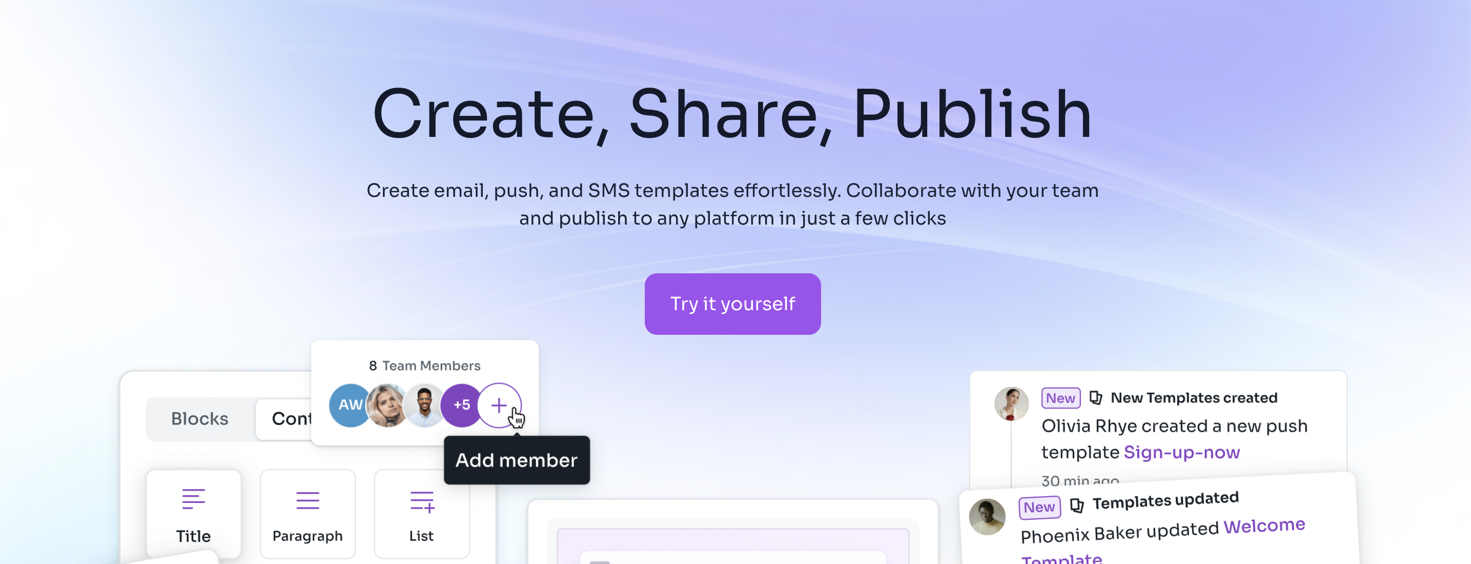
Blocfree is an email HTML editor that offers an easy way to create email templates. The platform features an intuitive email template builder that lets you quickly create and edit email templates to help you get started with email design. With Blocfree, you can:
- Easily craft email, SMS, and push templates to use across multiple platforms like Mailgun and SendGrid.
- Collaborate with your team to ensure everyone is on the same page before you publish your content to your preferred platform.
Get started with email design today by using Blocfree for free!